Tuesday, June 30, 2015

R for Stata users (part 2)

This is Part 2 of "How to convert from Stata to R". (If you haven't read Part 1, here's the link).

In this part, we will learn about sorting, generating/dropping new variables, linear regression, and post estimation commands.

If you haven't loaded the auto dataset, load it.

Task #6: Sort
While Stata has "sort", R has "order".
After you've loaded the dataset, enter
auto[order(auto$price),]
(don't forget the comma at the end!)
Notice that the dataset is sorted in ascending order:

                make price mpg rep78 ...
34      Merc. Zephyr  3291  20     3 ...
14    Chev. Chevette  3299  29     3 ...
18       Chev. Monza  3667  24     2 ...
68    Toyota Corolla  3748  31     5 ...
66            Subaru  3798  35     5 ...
3         AMC Spirit  3799  22    NA ...

If we want to sort it in descending order, we can insert "-" before auto$price. In other words, issue the following command:

auto[order(-auto$price),]

You should see that the Cad. Seville appears at the top.
What if we wanted to sort by headroom and then rep78? That's simple:

auto[order(auto$headroom, auto$rep78),]

If you wanted to put NA values first, use

auto[order(auto$headroom, auto$rep78, na.last=FALSE),]

If you wanted to save the sorted results as an object, use "<-", which is the assignment operator:

autosort <- auto[order(auto$headroom, auto$rep78),]

Simply put, the above command creates a new object called autosort, which is assigned the sorted auto dataset.

Task #7: Generate new variables

In Stata, you had "generate" or "gen". Creating new variables in R is equally simple. If we wanted to take logs of prices, the assignment operator comes in handy again:

auto$logprice <- log(auto$price)

A new variable called logprice has been created, and is now part of the dataframe.

You can verify that this is the case by typing:

auto

What if we wanted to generate a dummy variable (or "indicator variable") called highprice, equal to 1 when the price of the car was $8000 or higher, and 0 otherwise? Then the command

auto$highprice <- 0
auto$highprice[auto$price >= 8000] <- 1

would do the trick.


Task #8: Dropping variables and observations

Compared to Stata, you may need one more command to drop a variable in R, but it's still trivial. Let's say I want to drop the newly created variable logprice;

drops <- "logprice"
auto <- auto[,!(names(auto) %in% drops)]

The second command essentially replaces the auto dataset with a "new" dataset containing all variables in auto except logprice. Remember the comma!

What if I wanted to drop two variables? Use c, which is R's concatenate function:

drops <- c("headroom","trunk")
auto <- auto[,!(names(auto) %in% drops)]

and you will find that both headroom and trunk have been dropped.

What if I wanted  to drop certain observations? If we wanted to drop all cars priced above $10000, I could simply run:

auto <- auto[auto$price < 10000,]

Again, don't forget the comma towards the end. The experienced programmers should have figured out why we need the comma, and why it is placed where it is placed. For those who are less sure, type

auto[3,1]

and notice the output is

[1] AMC Spirit

In other words, RStudio is giving us the value of the third row and first column of the dataframe (think of the dataframe as the dataset). So the value before the comma indicates row, and the value after the comma indicates column. If we wanted all columns of the third observation (i.e. the entire third row), we would simply type

auto[3,]

omitting all numbers after the comma. It should now be clear why, in previous commands, the commas were placed where they were placed.


Remark: The beauty of R as compared to Stata is that one can create new datasets on the fly and keep both new and old datasets in memory at the same time. One can therefore do analyses on several datasets while keeping only one window open.

For example, auto_lowprice <- auto[auto$price < 5000,]
creates a new dataset containing low priced autos (below $5000). I can analyse both auto_lowprice and auto in the same window.

Task #9: Linear regression

In Stata, you have "reg" or "regress". R's analogous command is lm, short for "linear model".

Let's drop and load the auto dataset again, to ensure that we're on the same page. If you are unsure how to do this, use rm(auto) to remove the dataset from memory, and then load it by following the instructions in part 1.

Having loaded the original auto dataset, we can now run linear regression on the entire sample. Suppose we want to run a regression with price on weight and length (i.e. price is the dependent variable, and weight and length are independent variables).

The command

lm(price ~ weight + length, auto)

spits out the following output:

Call:
lm(formula = price ~ weight + length, data = auto)

Coefficients:
(Intercept)       weight       length  
  10386.541        4.699      -97.960  

The syntax goes like this:
lm(dependent var. ~ independent variables, dataset)

Notice that independent variables are separated by a plus ("+") sign.

As an experienced Stata user, you must be screaming now. "Where are my standard errors and p-values?"

That's simple.

summary(lm(price ~ weight + length, auto))

should give you what you want:

Call:
lm(formula = price ~ weight + length, data = auto)

Residuals:
    Min      1Q  Median      3Q     Max 
-4432.3 -1601.9  -523.6  1218.2  5771.0 

Coefficients:
             Estimate Std. Error t value Pr(>|t|)    
(Intercept) 10386.541   4308.159   2.411   0.0185 *  
weight          4.699      1.122   4.187    8e-05 ***
length        -97.960     39.175  -2.501   0.0147 *  
---
Signif. codes:  0 ‘***’ 0.001 ‘**’ 0.01 ‘*’ 0.05 ‘.’ 0.1 ‘ ’ 1

Residual standard error: 2416 on 71 degrees of freedom
Multiple R-squared:  0.3476, Adjusted R-squared:  0.3292 
F-statistic: 18.91 on 2 and 71 DF,  p-value: 2.607e-07

Task #10: Post estimation commands

R, like Stata, has numerous post-estimation commands. With this in mind, it may be useful to actually save the linear model before performing post-estimation commands:

my_model <- lm(price ~ weight + length, auto)

saves the linear model as my_model, following which

summary(my_model)

displays the results (just like we saw previously). Here's a sample of post-estimation commands:

confint(my_model, level = 0.9) # gives a 90% confidence interval of regression coefficients
fitted(my_model) # gives the predicted values of each observation, based on the estimated regression coefficients
residuals(my_model) # gives the residuals 
influence(my_model) # gives the basic quantities which are used in forming a wide variety of diagnostics for checking the quality of regression fits.

You've doubled your R knowledge by being able to do five more tasks. Congratulations!

In part 3, we learn about saving work, scatterplots, handling dates and times, and obtaining substrings.

R for Stata users (Part 1)

Stata is a popular data analysis software among economists and epidemiologists, to name two disciplines.

Stata's advantage is that it has a wide variety of pre-programmed functions. These functions are not only easy to learn, but also easy to use. However, trying anything that is not pre-programmed (e.g. creating your own algorithm) is going to be difficult. This is much less difficult in R.

How, then, can a veteran Stata user convert to R? Here's a useful guide to mastering the basics.

If you haven't already, download the R program from the R website. Next, install RStudio.

What is RStudio?

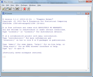
You may have heard that the R interface is very plain, with pretty much only a command line to enter your commands (see below):


In contrast, the RStudio interface is much more intuitive:

Source: rprogramming.net

Looks just as good as Stata - in fact, probably better. So after you've finished downloading and installing it, your screen should be something like this:


Task #1: Import and open a Stata dataset

Let's take Stata's famous auto dataset, which you may have heard of. (To access this in Stata, simply type "sysuse auto.dta"

Method #1: 
Open up Stata and load the auto dataset. Then save the auto dataset as a CSV file. Preferably name it auto.csv. If you don't have access to Stata now, here's a link to a CSV file.

Then go to RStudio and click Tools > Import Dataset > From Text File...

Below is a screenshot if you're not sure what to click.


You'll then encounter this dialog box.


Make any necessary changes (e.g. change "Heading" to Yes). Then click on "Import" on the bottom right hand corner. Your screen should look like this:


Look at the bottom left corner of the above screen. Notice how RStudio automatically generates the required command (just like Stata)? Also, RStudio automatically presents the data in the top left hand corner of the screen.

Method #2:
Install the package 'foreign', and then use this package to directly import a dta file

I'll leave this as an exercise, but will give some hints. You should start off with the following commands:

install.packages('foreign')
package(foreign)

Google if you're unsure how to continue!

(Another technical note: Since I am using RStudio here, I let blue Courier text denote commands and red text denote R's output. This is the opposite of other blog posts.)


Task #2: Create an R Script (aka 'do-file')

Recall how Stata had do-files? In R, you have R scripts. Just like do-files, these are simply text files containing commands.

Click File > New File > R Script


and you'll notice that an "Untitled1" file covers the auto dataset. Now we can start writing our do-file (okay, from now onwards I'll say R Script).

Task #3: Generate summary statistics

In the top left corner (not the console window) Type in summary(auto) and click run (near the top right hand corner of the editor. If you can't find it, press Ctrl+Enter and the code will run.

You'll observe some summary statistics in the Console screen. Some questions naturally arise.

Q: What if I only want one variable?
A: Try using the dollar sign. For example, summary(auto$price)

Q: But when I type "codebook" in Stata, it gives much more useful information such as number of missing values, etc. How can I generate these statistics?
A: Try the following commands:

install.packages('pastecs')
library(pastecs)
stat.desc(auto)

or if you prefer to look at a single variable (e.g. price), replace the last line with

stat.desc(auto$price)


Task #4: Generate correlation matrices

For preliminary data analysis, you may wish to generate correlation matrices. (These are done with corr or pwcorr in Stata).

For R, the analogous function is cor.

One may be tempted to type in cor(auto). However, RStudio displays the following error:

Error in cor(auto) : 'x' must be numeric

The non-numeric variables are preventing R from displaying the correlations. You can rectify this by issuing the following command instead:

cor(auto[sapply(auto, is.numeric)])

and the output should start like:

                  price        mpg rep78   headroom      trunk
price         1.0000000 -0.4685967    NA  0.1145056  0.3143316
mpg          -0.4685967  1.0000000    NA -0.4138030 -0.5815850
rep78                NA         NA     1         NA         NA
headroom      0.1145056 -0.4138030    NA  1.0000000  0.6620111

What does sapply do? You would normally type "help sapply" in Stata, but the command is slightly different in R:

? sapply

The help file will load in the bottom right hand corner. Take a good look at it.

You may want to annotate your file at this point. For example, write a comment to remind yourself about what sapply does. In R, comments start with the pound sign ("#"). RStudio will display comments in green, just like Stata.

Task #5: List observations fulfilling certain criteria

You must be itching to find R's version of Stata's list function. It's just a different word:

To list the entire dataset:
print(auto)

To list only cars with gear ratio above 3.8:
print(subset(auto, subset = gear_ratio>3.8))

To list only foreign cars:
print(subset(auto, subset = foreign=="Foreign"))

To list only cars with gear ratio above 3.8 and mpg above 30:
print(subset(auto, subset = gear_ratio>3.8 & mpg > 30))

You've learned five crucial tasks. Part 2 will teach you five more key tasks!

Saturday, June 13, 2015

Introduction to R for Excel users

You've been using Excel a lot, but are new to R. You're wondering how to transition from Excel to R smoothly. If so, this post is for you.

First, open the R interface and you should reach this screen:


We're going to use a package called ggplot2. (Think of it as an "add-on" to R). In R, you need to load packages through the library function, so type in the following command:
library(ggplot2)
This package contains the dataset mpg that we need to use:
mpg
You should see lots of lines of text after typing the above command. I've copied and pasted the start and end:

    manufacturer                  model displ year cyl      trans drv cty hwy fl      class
1           audi                     a4   1.8 1999   4   auto(l5)   f  18  29  p    compact
2           audi                     a4   1.8 1999   4 manual(m5)   f  21  29  p    compact
3           audi                     a4   2.0 2008   4 manual(m6)   f  20  31  p    compact
...
232   volkswagen                 passat   2.8 1999   6   auto(l5)   f  16  26  p    midsize
233   volkswagen                 passat   2.8 1999   6 manual(m5)   f  18  26  p    midsize
234   volkswagen                 passat   3.6 2008   6   auto(s6)   f  17  26  p    midsize 

As you can see, there are 234 observations of popular cars from 1999 to 2008.

Sorting

Obviously, the variable "year" contains information about the year of a specific model. Let's say we want to see the latest models first.
How can we tell R to sort the data accordingly? We can use the order command:
mpg[order(mpg$year)]
Notice that mpg is again a reference to the mpg dataset, and by using the square brackets ([]) I'm saying I want to access certain list members, or arrange them in a specific way. the function order is key here: it tells R to sort the data. Finally, mpg$year says, "Sort according to the year variable in the mpg dataset".
R processes the command and outputs:

    manufacturer                  model displ year cyl      trans drv cty hwy fl      class
1           audi                     a4   1.8 1999   4   auto(l5)   f  18  29  p    compact
2           audi                     a4   1.8 1999   4 manual(m5)   f  21  29  p    compact
5           audi                     a4   2.8 1999   6   auto(l5)   f  16  26  p    compact
...

Whoops! Notice that the default is to output in an ascending order. To fix this, simply add a minus sign in front of mpg$year:
mpg[order(-mpg$year)]
Now you should get what you want.

Challenge 1: Sort by year, and then displ
Challenge 2: Sort by year, and then manufacturer (this is a little harder because manufacturer is a string variable)

Manipulating variables

The variable cty refers to "miles per gallon for city driving". Likewise, hwy refers to "miles per gallon for highway driving". Let's say I'm sending this dataset to a European friend, and I'd like to convert them into liters per 100 km.

Working through the math, we realize that 1 mile per gallon is 235 liters per 100 km.

It's easy to do the conversion:

mpg$hwy <- mpg$hwy * 235
mpg$cty <- mpg$cty * 235  

If we were driving on the highways 40% of the time, and driving within the city 60% of the time, it would be easy to construct a weighted average:

mpg$wtavglp100k <- mpg$hwy*0.4 + mpg$cty*0.6

lp100k is shorthand for liters per 100 km.

Rename variables

Recall we had done some metric conversion for our European friend. How can we remind ourselves that we've done these conversion?
The following commands should make clear what units the variables are in: 
names(mpg)[8] <- "lp100k_cty"
names(mpg)[9] <- "lp100k_hwy" 

Capturing part of a variable

Let's take a look at the trans variable closely:
summary(mpg$trans)
outputs

auto(av)   auto(l3)   auto(l4)   ...
      5          2         83    ...
auto(s6) manual(m5) manual(m6) 
     16         58         19 

How can we shave off the items in brackets?

There are several methods available. Some methods are short and sweet but rely on a crucial aspect of the dataset we're working on now (e.g. there are only auto and manual cars). Others are longer, but are more generalizable (i.e. the methods can be applied to other datasets as well).

Method 1

mpg$transmission <- substring(mpg$trans,1,4)
mpg$transmission[mpg$transmission=="manu"] <- "manual"

Method 2

use gsub, which substitutes an expression for another.

Note: we need to use double backslash (i.e. \\) because "(" is considered to be a metacharacter. (Think of a metacharacter as a special character).

mpg$trans <- gsub(\\(.*$","",mpg$trans) # best
or
mpg$trans <- gsub(\\(..\\)","",mpg$trans)
or
mpg$trans <- gsub(\\([a-z][a-z0-9]\\)","",mpg$trans)

In the first command, .*$ pick up everything after the opening bracket (. Likewise, ..\\) and ([a-z][a-z0-9]\\) do the same. This document produced by Svetlana Eden is an excellent guide to knowing the finer details of what was done.

Method 3

a <- regexpr("\\(",mpg$trans) # finds the position of (
mpg$trans <- substr(mpg$trans,0,a-1) # drops everything including and after (
rm(a) # removes the variable a, which was intended to be a temporary variable

Using any of these methods, all the text following ( is now deleted. We can verify this by typing mpg$trans or (better) if we want to be doubly sure, type unique(mpg$trans)

Friday, June 12, 2015

Plotting geographical incidence of a disease

Can we use R to plot maps of the incidence of a disease? Short answer: Yes, easily.

Let's take a look at an example.

According to the Mayo Clinic, sudden infant death syndrome (SIDS) is the unexplained death, usually during sleep, of a seemingly healthy baby less than twelve months old.

Medical researchers have produced a dataset of SIDS incidence in North Carolina. This link gives lots of information. (However, you aren't required to read it.)

First off, let's install and load the required packages (again, you don't need to install them if you've done so previously):

install.packages('rgeos')
install.packages('maptools')
install.packages('plotGoogleMaps')
install.packages('spacetime')
install.packages('rgdal')

library(rgdal)
library(rgeos)
library(maptools)
library(RColorBrewer)
library(spacetime)
library(plotGoogleMaps)

Next, let's load the North Carolina SIDS dataset:

nc <- readShapeSpatial(system.file("shapes/sids.shp",package="maptools")[1], proj4string=CRS("+proj=longlat +datum=NAD27"))

readShapeSpatial is a function which (unsurprisingly) reads shape files, and outputs Spatial*DataFrame objects. The first argument entered specifies the file to be read, and the second argument specifies the output.

You may be wondering, what is a Spatial*DataFrame object? If this documentation isn't particularly enlightening, there are easy ways to find out more:
nc
outputs the following:

class       : SpatialPolygonsDataFrame 
features    : 100 
extent      : -84.32385, -75.45698, 33.88199, 36.58965  (xmin, xmax, ymin, ymax)
coord. ref. : +proj=longlat +datum=NAD27 +ellps=clrk66 +nadgrids=@conus,@alaska,@ntv2_0.gsb,@ntv1_can.dat 
variables   : 14
names       :  AREA, PERIMETER, CNTY_, CNTY_ID,     NAME,  FIPS, FIPSNO, CRESS_ID, BIR74, SID74, NWBIR74, BIR79, SID79, NWBIR79 
min values  : 0.042,     0.999,  1825,    1825, Alamance, 37001,  37001,        1,   248,     0,       1,   319,     0,       3 
max values  : 0.241,     3.640,  2241,    2241,   Yancey, 37199,  37199,      100, 21588,    44,    8027, 30757,    57,   11631 


As you can tell, nc contains both geographical information (see the third line) as well as information of the incidence of SIDS in each North Carolina county (see the line containing names)

Variables starting with SID refer to the incidence of sudden infant death syndrome, while BIR refer to the number of babies born, and NWBIR refers to non-white births.

If you're curious, find out even more through:
summary(nc)
Next, let's plot the SIDS data onto Google Maps. Notice the first argument specifies the SIDS dataset, while the second argument specifies the column 

plotGoogleMaps(nc, zcol="SID74")


If you are doing the exercise in R, you can click on each county to find out more information.

For good measure, let's try a different version of Google Maps:

plotGoogleMaps(nc, zcol="SID74" , mapTypeId='road',colPalette= brewer.pal(7,"Reds"), strokeColor="white")

As an (easy) exercise, plot birth rates and non-white birth rates.

This example is generalizable: one can easily imagine plotting the incidence of poverty rate, telephone penetration, voting behavior, and so on.

Overlay two map layers

Let's say we have two layers of a map, and want to lay one on top of the other. How can we do this?

Let's take a look an an example, where we create a hillshade map of Spain, and the elevation of Spain, and plot the latter on top of the former. For those unfamiliar with geography, hillshade refers to shade provided by hills, due to the sun shining from an angle.

Source: qcoherent.com

An example is provided above. Notice that there's a shadow on the southeast corner of the hill.

One popular format for storing geographical data is the raster format, where each coordinate takes on a certain value. As such, you'd have to load the raster package:
library(raster)
(Of course, you would download the package by install.packages('raster') if the above command threw an error message).

Next, download Spanish geographical data:
elevation <- getData("alt", country = "ESP")
Hillshade isn't directly contained within the downloaded dataset. Fortunately, hillshade is some combination of slope and aspect, and the dataset has them both. So let's store slope and aspect data:

x <- terrain(elevation, opt = c("slope", "aspect"), unit = "degrees") 
slope <- terrain(elevation, opt = "slope") 
aspect <- terrain(elevation, opt = "aspect") 

For good measure (this is not really required), let's visualize both slope and aspect:
plot(x)

We let R calculate hillshade based on slope and aspect:
hill <-hillShade(slope, aspect, 40, 270) 
Now we reach the essence of what we want to do. Let's plot hillshade, which forms our first layer:
plot(hill, col = grey(0:100/100), legend = FALSE, main = "Spain") 
Elevation will form our second layer: 
plot(elevation, col = rainbow(25, alpha = 0.35), add = TRUE)
Notice that "add = TRUE" causes layer 2 (elevation) to be plotted on top of layer 1 (hillshade).


Ta-da! You've just completed overlaying maps in R.

Spatial analysis

Continuing from our last post about crime in Charlotte, North Carolina, USA. (If you didn't read it, it's fine).

Suppose you had a database containing information on crime committed in Charlotte, containing the location of each crime report. How can you use R to determine which areas have the most crime?

Some preliminaries:
install.packages('maptools') # no need to run this if it's installed
install.packages('spatstat') no need to run this if it's installed
library(maptools)
library(spatstat)

Then, download all files in this folder (these collectively form what is known as a "shape file". Essentially, Charlotte's shape is recorded as a polygon.) Place the files in R's working directory (type getwd() if you are unsure what's your working directory).

If you weren't continuing from our last post, you'd also want to load the crime data. Download this file and place it in your working directory. Then run the below command:
mydata <- read.table("CLTCrime.csv",sep=",", header=TRUE)  #change the directory if necessary

Next, the following commands plot crime incidents on Charlotte on the City Council's boundaries:

CLTbdry<-readShapePoly("CityCouncil_Boundary.shp") # the above data file contains a polygon in the shape of Charlotte.
bdry<-as(CLTbdry,"owin") # as function forces CLTbdry to become a boundary.
myppp<-ppp(mydata$longitude, mydata$latitude,window=bdry) # the ppp function creates a point pattern dataset. 
# crime data is obtained from the longitude and latitude coordinates, and the boundary is accessed in the third argument (window=bdry)
png(filename="clt_crime.png") # saves plot into png file
plot(myppp) # crime committed in charlotte
dev.off() # turns off recording into png file

Opening clt_crime.png, you can see:

Finally, let's divide Charlotte into quadrats (note; this is different from quadrants. Quadrats are essentially "subplots" of an area)

myQC<-quadratcount(myppp) #by default it applies 5*5 quadrat
myQC   #check the details of quadrat count
plot(myQC) #plot the results as below

The output of myQC is as follows:

               x
y               [-81.01,-80.94] (-80.94,-80.87] (-80.87,-80.79] (-80.79,-80.72] (-80.72,-80.65]
  (35.32,35.4]                1               3              16               7               2
  (35.24,35.32]              24              27              67              65              21
  (35.17,35.24]               4              75             126              86              28
  (35.09,35.17]              18              55              34              29               1
  [35.01,35.09]               0               2              23              17               0

How would you read the above table? An example: the "126" in the middle cell indicates that for the quadrat (rectangle) with longitude -80.87 to -80.79 and latitude 35.17 to 35.24, there were a total of 126 crimes reported.

And plot(myQC) gives:

You now have two different ways of telling which areas of Charlotte have more crime than others!

Don't stop reading: there's more. What if we wanted to generate a "heat map" of crime in Charlotte, telling us where the crime hotspots are?

Crime "heat map" of Charlotte

R allows us to generate such heat maps easily through a simple command:
plot(density(myppp, 0.01))
The function density does what is called "kernel density estimation". If you don't really know what kernel density estimation is, this site is a good introduction to the intuition behind KDE. The Wikipedia page is pretty good for technically inclined readers too.

But for those short on time, here's a rough overview of what KDE is.

Let's take a look at the below picture. Assume that crime reports are represented by red dots (on the flat surface).

Source: Wikipedia

For each grid coordinate, KDE generates an estimate of the number of points that are "close" to the grid coordinate.
For example, there are very few red dots at any edge of the grid, hence crime incidence is estimated to be negligible there.
On the other hand, in the center of the grid, there are lots of red dots. Therefore, KDE would estimate that crime is very high in the center. Notice the two high peaks in the center. Essentially, the result of the KDE estimator are the "mountains", and the peaks are where crime incidence is estimated to be highest.

We mentioned that KDE generates an estimate of the number of points that are "close" to the grid coordinate. You must be wondering: what exactly does "close" mean? Whether a point is close depends on something called the bandwidth which has to be specified by the user (you). Roughly speaking, if the bandwidth is 0.01 units, then red dots within 0.01 units of a point will be considered close to that point. On the other hand, if the bandwidth is 1 unit, then red dots within 1 unit of a point will be considered close to that point. (This is of course inaccurate, but the main purpose is to give intuition).

Let's increase our bandwidth by ten times (to 0.10) and see what happens:

This neatly illustrates the perils of choosing too high a bandwidth. Too many points are considered to be "close" to any point on the grid map. As a result, the heat map provides little information about the crime in Charlotte.

Having too low a bandwidth can be dangerous too. To illustrate, let's decrease our bandwidth by a hundred times:

Almost no crime reports were judged to have occurred "close" to any grid point in Charlotte. As a result, one might think that Charlotte is crime-free.

How should one select the bandwidth? First, it is important to consider the data itself. If you were to type myppp, R would output

planar point pattern: 731 points
window: polygonal boundary
enclosing rectangle: [-81.00963, -80.65147] x [35.01052, 35.40026] units
*** 38 illegal points stored in attr(,“rejects”) ***

Crime appears to be recorded in degrees for both longitude and latitude. (Trivia: one degree of longitude or latitude is equivalent to around 111 kilometers/69 miles at the equator. At Charlotte's location, one degree latitude is still 111km, but one degree longitude is around 90km. But for simplicity's sake, let's take one degree to be 100km each way here.)

Another point to consider is that myppp consists of individual crime reports, not crime reports at the county (or neighborhood) level.

Here comes the subjective part. Most people would not be bothered by crime reports (e.g. stolen vehicle) that occur 10km away from where they stay. Thus setting the bandwidth to 0.1 degrees (10km) would mean that when calculating "crime intensity" for a specific area, we'd be including crime that wouldn't bother most people.

On the other hand, if we were to set the bandwidth to 0.001 degrees (0.1km, or around 300 feet), we would be effectively excluding crime that would bother most people. (Technical note: I say effectively, because although crime further than 0.1km is taken into account by most kernels (think of a kernel as an "estimation technique"), the weight assigned will be typically very small.)

Thus the sweet spot would probably be around 0.01 degrees, or 1km. Most people would be significantly bothered by crime that occurs within 1km of where they stay, but wouldn't be too bothered by crime that occurs beyond that (unless, for example, there are many such crime incidences).

Of course, if one wanted to be rigorous (e.g. for producing an academic report), one might actually survey Charlotte's residents and find out how far away a crime has to be before they are not bothered by it.

What if one didn't have much specific information regarding the dataset (e.g. one is breaking new ground in a certain area, or just doesn't have the expertise in the area)?

There are some rules behind choosing the optimal bandwidth published in academic journals. However, in some aspects choosing the best bandwidth is an art. The less mathematically inclined may wish to consider the following rule of thumb:

Pick an arbitrary bandwidth.
- If it seems too low, multiply it by 3. If it still seems too low, multiply it by three again, and so on, until it becomes too high.
- Conversely, if the bandwidth seems too high, divide it by three again and again until it seems too low.
Pick the diagram which best represents the picture you want to convey (you may wish to do further adjustment of the bandwidth before coming to your final choice).

I hope this introduction to spatial analysis and kernel density estimation in R was interesting. Thanks for reading this! :)

Acknowledgements: Nick Cox provided useful comments on a question I posed on Stackoverflow. All errors are mine.

Google Maps for the uninitiated

Are you a regular user of Google Maps, but are wondering how to use it in R? If so, this post is for you.

You'll need to install several libraries and load them:

install.packages(raster)
install.packages(sp)
install.packages(dismo)
install.packages(XML)

library(raster)
library(sp)
library(dismo)
library(XML)

As a reminder, packages are "add-ons": collections of functions, data, etc. which can be used in R.

But plotting is surprisingly simple All you need is an internet connection:
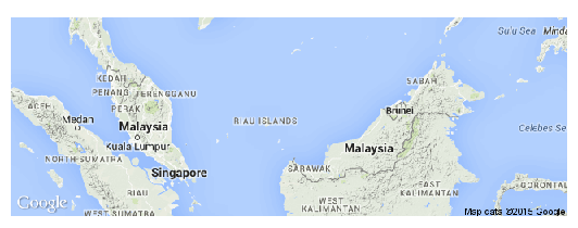
plot(gmap('malaysia'))
gmap calls the Google Maps function, and then I specify what map I want (in this case, Malaysia). Don't forget the quotes, although it doesn't matter whether you use double quotes or single quotes. R then loads Google Map's view of Malaysia.


Notice that Malaysia is divided into two halves. (Observe there are two labels of Malaysia, one on the left side of the diagram, and the other, on the right.)

Most Malaysians, however, stay in the western half of Malaysia. The capital Kuala Lumpur is in the western half of Malaysia too. Thus I might only want to see the western half.

In this case, I can click
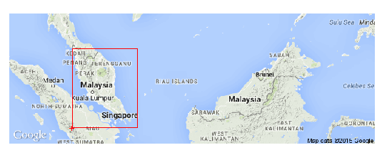
myRegion <- drawExtent() 
Then, click twice to draw a rectangle around the western half:
For example, you can click at the bottom left hand corner, and the top right hand corner (which is what I did). Or you can click at the bottom right hand corner, and the top left hand corner. (Notice, you only need to specify two opposite ends of a rectangle to define a rectangle).

R then records myRegion as the red box. To get better view, type

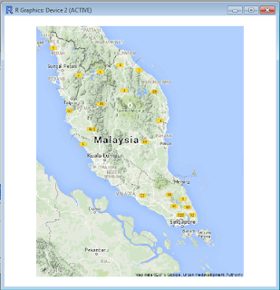
plot(gmap(myRegion)) # without quotes, since it is a variable.
Recall once again that everything after the pound (#) sign is a comment and will not be processed by R.
And there you have it: a better view of west Malaysia.


Now, let's see how we can plot data onto Google Maps.
Download this file and place it in your working directory. (If you're unsure of you're working directory, type getwd()and see what comes up)
The file is a CSV file containing crime data in Charlotte, North Carolina, USA.

Let's load it into memory and plot the points:

mydata<-read.table("CLTCrime.csv",sep=",", header=TRUE)  #this loads the CSV file. make sure the CSV file is in your working directory.
names(mydata) # gives you the variable names
coordinates(mydata) <- c("longitude","latitude") # sets the spatial coordinates of each observation (as the longitude and latitude)
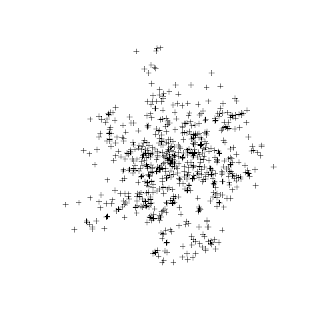
plot(mydata) # scatterplot of crime points without map


We've plotted the geographic location of each crime incident in Charlotte. Much of the crime occurs in a central location - probably Charlotte's downtown. However a big piece of the picture is missing: a map of Charlotte.

Let's add on a map of Charlotte:
crs.geo <- CRS("+proj=longlat +ellps=WGS84 +datum=WGS84")  # describes the projection system you want to use.
proj4string(mydata) <- crs.geo # sets projection attributes
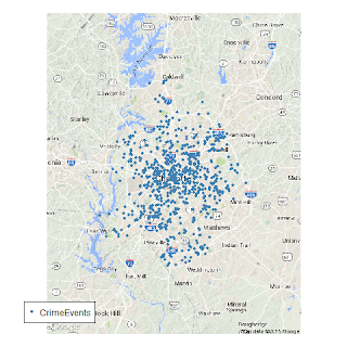
gbmap <- gmap(mydata) # gives the map which contains all the data points. (happens to be charlotte)

mydata.merc<-Mercator(mydata) # Sets the data to mercator. This is necessary because Google Maps are in Mercator projection.
plot(gbmap) # produces the map of Charlotte
points(mydata.merc,pch=20,col="steelblue") # superimposes points.
legend("bottomleft",inset=.07,bg="white", legend="CrimeEvents",pch = 20, col="steelblue") #adds a legend 

The commands might be confusing to most, even after I've annotated comments. The first three commands are mainly technical. Together, they create the map which will be sufficient to contain the points in the dataset "mydata". Notice that if "mydata" had contained crime in the US, the map generated would have been that of the US.

The command mydata.merc<-Mercator(mydata)adjusts the coordinates to fit the Mercator convention, since that's what Google Maps uses. Subsequently plot(gbmap) and
points(mydata.merc,pch=20,col="steelblue") add the map and superimpose points respectively. Finally, a legend is added.  

Look at the beautiful map that R and Google Maps produced!


There is another (perhaps more elegant) way of doing this:

library(googleVis) # if you don't have this package, then run install.packages('googleVis') first
mydata<-read.table("CLTCrime.csv",sep=",", header=TRUE)# change the directory as necessary
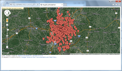
M1 <- gvisMap(mydata,"LatLong","Descrip")
plot(M1) # plots the map by loading it into a browser

gVisMap calls the Google Visualization API. The first argument, mydata, tells Google which dataset needs to be used. The second argument, LatLong, tells Google, "The location of each observation is contained within the LatLong variable in mydata.". The third argument, Descrip, tells Google, "For each observation, the value of the variable Descrip describes the observation". In other words, Descrip provides a description (or acts as a "label") of the crime that happened.

The command plot(M1) then opens a web browser and displays the following map:


If you actually did this exercise, you would be able to click on each crime report to discover what crime was reported (that's the value of the variable "Descrip")

Congratulations on your first use of Google Maps in R!

Maps in R for dummies

You're an absolute beginner to R, or you've not used R for a long time, and are wondering how to draw maps in R. If this describes your situation, then this post is for you.

First off, open R and you should get into this window.


(It's fine if you use more intuitive interfaces such as Quick-R.) Next, if you have not installed the maps package, you will need to install it using the following command:

install.packages('maps')
For the uninitiated, packages are collections of R functions, compiled code, and data. Think of it as an "add on".
R may tell you that
package ‘maps’ successfully unpacked and MD5 sums checked
upon a successful installation. It may also tell you that you've already installed the package, which is fine.
Although you've installed the maps package, you've not loaded it into memory. Thus, R can't use the maps package yet. As such, type
library(maps)
to load the package into the R workspace. Notice there is no need for quotes.
Let's try to plot the first map:
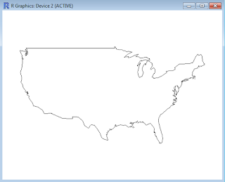
map('usa')

What if I want to see state boundaries?
map('state')
 Not a problem. Let's try California. Since it's a pretty large state, we add axes to see the longitude and latitude:
map('state','california')
map.axes() 

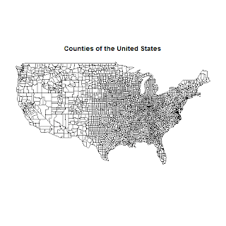
And what about US county boundaries?
map('county')
Of course, you may want to add a title to your map. After typing in map('county'), type the following command without closing the map window:
title("Counties of the United States")
What if I wanted to save the picture to disk?

getwd() # gets the working directory
png(filename="counties.png")# creates a file called "counties.png"
map('county') # writes the county map to the png file
title("Counties of the United States") # adds title
dev.off() # turns off recording, i.e. output no longer goes to the png.

If you're not used R for a long time, remember that the pound sign (#) is for comments. Thus everything I've highlighted in green is a comment and will not be processed by R. It's good practice to annotate your code extensively. It will help you learn faster, and when you

When you open counties.png, you should get the following map:
So far, so good. But it's pretty boring if we can only see US states and counties. Anyone can Google those up. What else can we do?

Let's label the main cities of Rhode Island. First, we load data of US cities into R. Then we create a pdf file and save Rhode Island and its cities into the file.

data(us.cities)
pdf(filename="rhodeisland.pdf")
map('state','rhode island')
map.cities(us.cities,country="RI")
dev.off()

gets us this map:


You may be wondering whether R's map package contains only US maps. Nope! Try other countries such as New Zealand:
map('nz')
We have only touched the tip of the iceberg. There's so much more the package can do. For example, you can plot US unemployment, pollution, and voting data on the maps. The first step is to load these datasets:

data(ozone)
data(unemp)
data(votes.repub)

Challenge: plot these data onto US maps.

R provides extensive documentation for the maps package, which includes the solution to these challenges.